


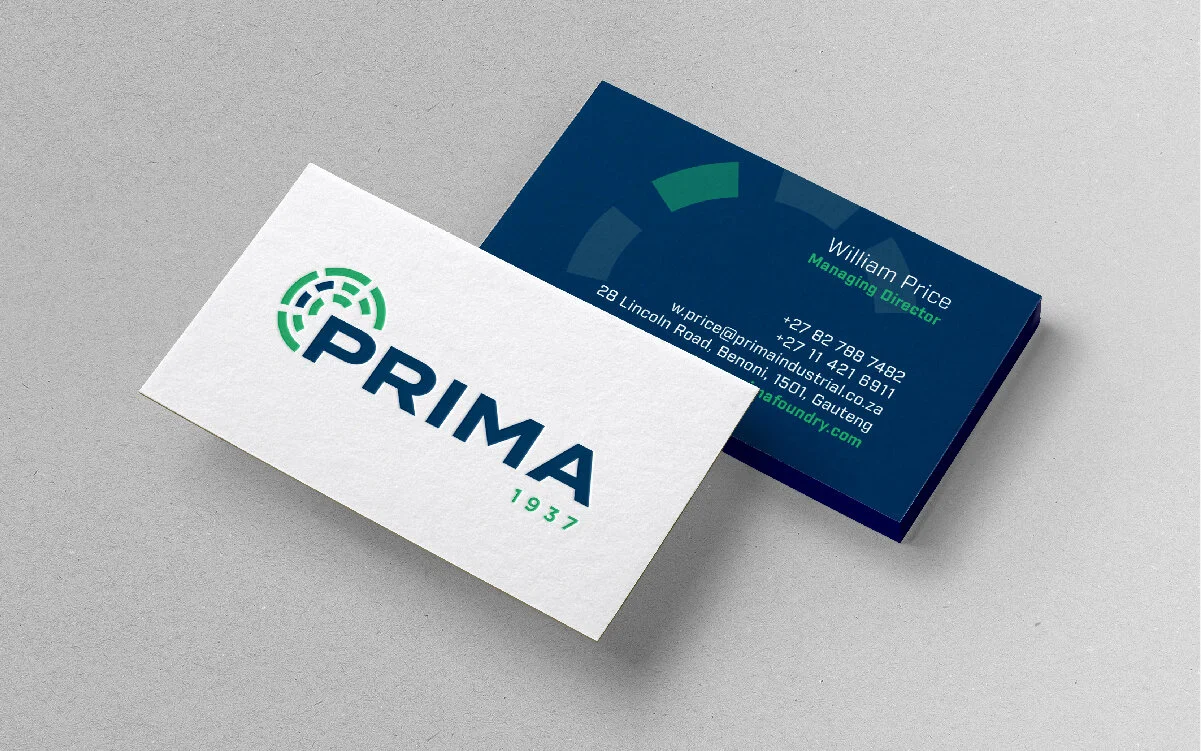

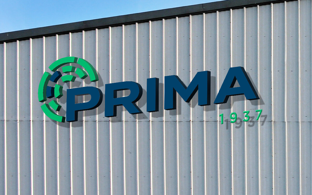
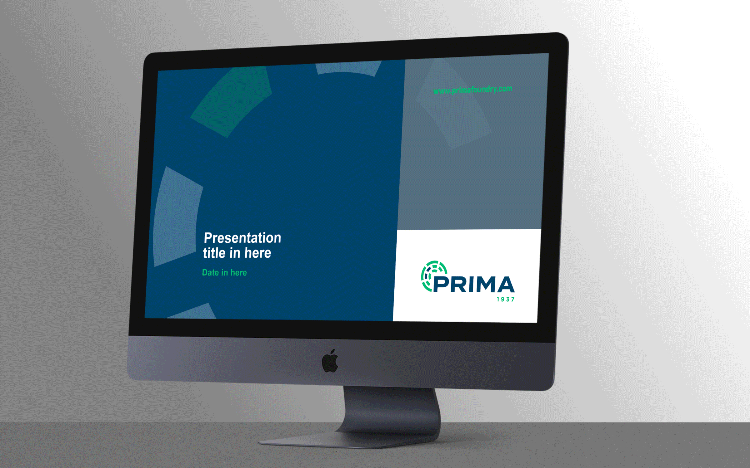

The new brand identity symbolises the rich history of Prima and a bold vision for the future. The blue and green primary colours represent the stability and expertise that 80-years of experience in business brings whilst sticking to the vision to remain relevant to their customers. The logo is inspired by the outline of a mill liner assembly. Four outer lines of the logo were used to represent Prima’s key values: partnership, reliability, value and innovation.