_ Logos
_ Visual identity systems
_ Visual languages
_ Brand guidelines
_ Packaging
_ Layout & publications
_ Social media posts
_ Squarespace websites
Everything is designed with one significant purpose, to make our clients roar.
Design collaboration with fountstudio.co.za
The hotel restaurant at Emperor's palace received a makeover and with that we were tasked with the renaming and rebranding. Reign subtly eludes to its location, with a fresh new modern and sophisticated offering.
The logo embodies this same approach - a bold modern update of the royal tradition of heraldry. The choice of font enhances the nostalgia of yesteryears with a nod to the Art Nouveau inspired interior. The heraldic theme is echoed in various design elements to form a versatile and adaptable visual pattern.
Name generation & brand strategy: Richard Strydom
Interiors: sketchstudio.co.za
Design collaboration with fountstudio.co.za
Strategy & project management: liquorishink.co.za
Proud Mary is in the heart of Rosebank. It is a progressive modern café and bar. The design is driven by both mid-century and contemporary elements.
Trifour is a tech company that helps healthcare institutions digitise the patient journey.
Four shapes are overlapped to create a logo with a subtle medical cross to create a link between the brand and the healthcare industry.
The concept of ‘digitising healthcare’ comes to life with connection point circles that are combined with dimensional textures to represent back-end code & data.
Baby culture is a bespoke baby boutique with modern hand-crafted clothing in earthy tones and natural materials. A characterful customised hand-drawn font is created to make up the logo. The star adds a whimsical and playful touch.
Collaboration with fountstudio.co.za
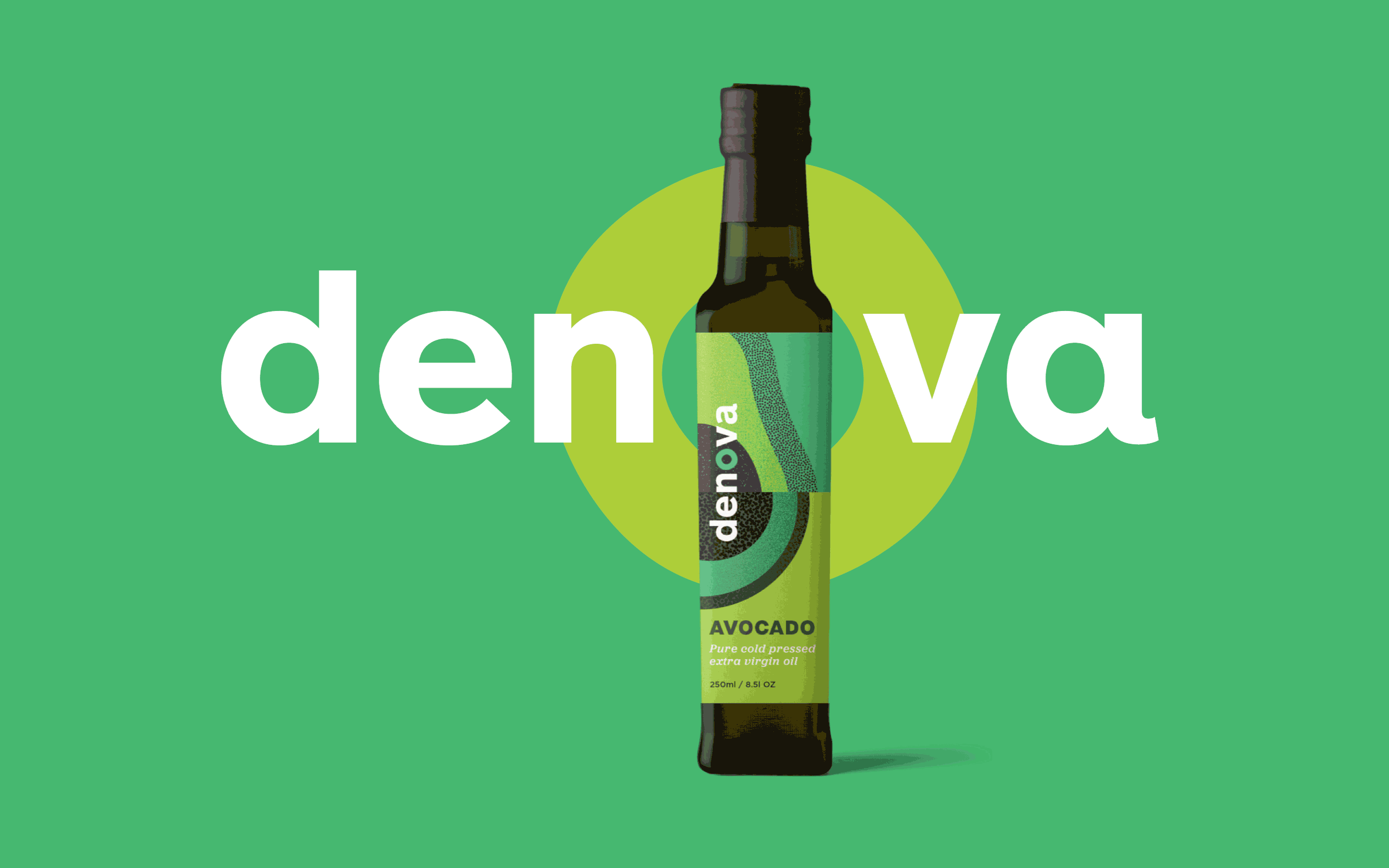
Identity and packaging design for a range of avocado, apricot kernel and macadamia nut oils. These pure cold pressed oils are harvested in the sunny climate of Limpopo, South Africa. The ‘o’ is odd-shaped and organic to echo the product contents, which are often not ‘perfect’ in shape. The illustrations celebrate the concept of a layered structure, found in the fruits & nuts as well as the soil in which it grows. The vibrant colours bring the heritage of the South African product to life.
A timeless, premium wordmark was designed for a start-up financial service firm. The simplicity of the wordmark portrays an image of unquestionable luxury and timelessness - both concepts that are well understood by the Addison Advisory client.
A vibrant new logo that combines a simplified DNA strand with the ‘P’ in Portfolio Pharmaceuticals. The new brand identity showcases the vision for a healthy, vibrant society and celebrates life, health and well-being.
Who thought taking your daily dose of vitamins could be so exciting?
The range was renamed to ‘Bodivite’ to make it more playful. The bold illustrations not only explain the function of the vitamins but are eye catching and fun. An exciting new approach to the taking of daily vitamins.
A special thanks to Dominic Nugent from Britepack for his advice and assistance with prepping the artwork for print.
Packaging shoot by dalephotography.co.za
Digibook provides online exercises for young grammar learners in Grades 5-9. We worked closely with Digibook to transform the former look and feel from corporate and functional to the current high-contrast, energetic, video game appearance that introduces learning in a fun and exciting way. We collaborated with Firejuice (strategy) and Aglet (UX) to create a new website that has a youthful look to get learners to engage with the exercises.
aglet.co.za | firejuice.co.za
By keeping the essence and story of these brands, we met these corporate clients’ needs by designing logos that have evolved from the existing known to the new, modernised and refreshed, yet familiar logos, to stand out in an image driven world.
Safety is a common issue for South African mountain bikers. MTB FiT provides a safe mountain bike spinning experience with TrailShredda and the comfort of your own bicycle.
The logo is the stopwatch you’re watching, counting every second you spin, faster and faster, to get you fit, to get you in your best shape, to get out and let your newly acquired skills rip on that favourite mtb trail of yours.
Sponsbons is a business that rents out children’s soft play and obstacle toys in Pretoria. Sponsbons, directly translated to English, means ‘sponge bounce’. The logo and colours are as energetic as the toddlers bouncing on these fun toys.
The new brand identity symbolises the rich history of Prima and a bold vision for the future. The blue and green primary colours represent the stability and expertise that 80-years of experience in business brings whilst sticking to the vision to remain relevant to their customers. The logo is inspired by the outline of a mill liner assembly. Four outer lines of the logo were used to represent Prima’s key values: partnership, reliability, value and innovation.
A new currency is emerging. A currency of giving. By combining the G, L, and = characters, a new currency symbol emerged.
givin’ is livin’ encourages a new mindset where fashion is more than just consumption and keeping up with trends. In this case, engaging with fashion becomes an ethical and sustainable act, where giving becomes the intention instead of spending.
Collaboration with fountstudio.co.za
This corporate identity for Servus Properties Group reflects the vision of the company to not merely be a seller of properties but to be a developer that, like a river, brings life and sustainability to the community.
The icon plays with a subtle S that resembles a life bringing river meandering through the land.
A brand toolkit was designed for Firejuice to create a consistent look for their social media platforms. The toolkit included fonts, colours and an image library. The assets were uploaded to Canva and the Firejuice staff was trained to use the templates to create their own creative posts.